[Apr. 2025]
1
The typeface St. Martin highlights a typographic artifact found in the works of the 19th-century Parisian printer Jean-Alexis Rouchon and mixes it with the supposed neutrality of a sans-serif base. In the essay, St. Martin, the Stencil Type that Wasn’t, I speculate on the possible origins of the defining feature of the design.

Excerpt from a Rouchon poster retyped in St. Martin.
In 2024, during a class by Prof. Pierre Pané-Farré and Simon Thiefes at the HAW Hamburg, ten fellow type design students and I examined the body of work by Jean-Alexis Rouchon. The culmination of our analysis and research was a publication we called A Case Study, for Example R., which was later published under the microlabel Pantograph. My contribution to the project was the typeface St. Martin.¹
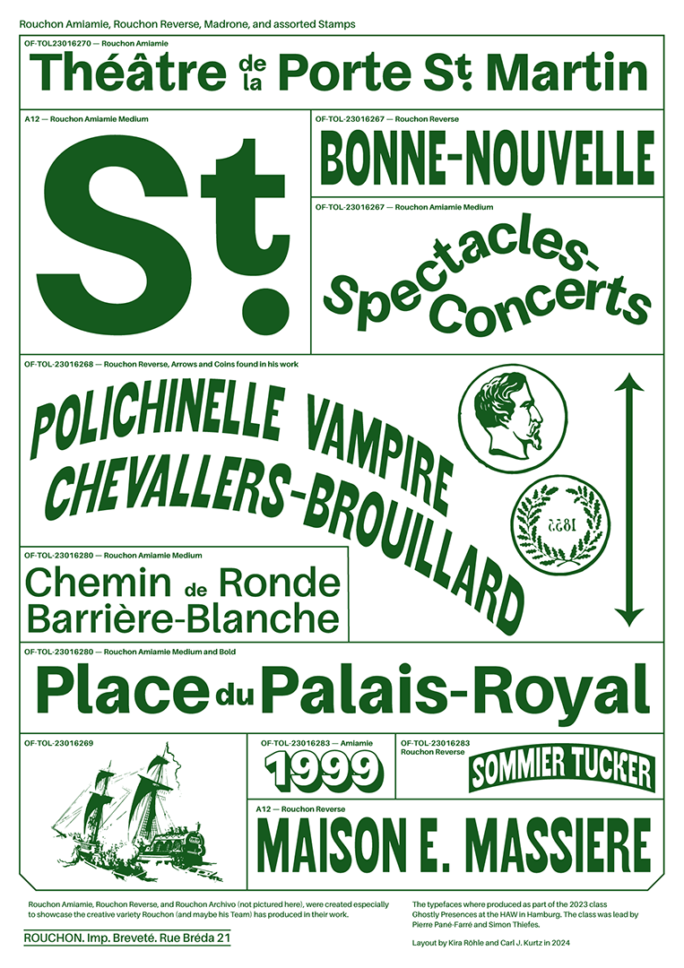
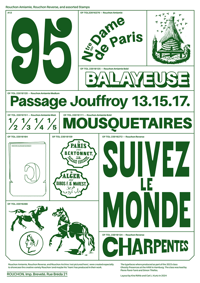
St. Martin in use on a poster together with Rouchon Reverse by Lorenz Fackler.
In roughly 36 of the 110 posters we analyzed, we found a peculiar corner shape that appeared wherever a shoulder, bowl, or arm meets the stem of a letter. Therefore, it appeared more commonly in lowercase than in uppercase letters. (Most often in a, u, n, r, m, h, b, p, q, and d.) It is this feature that informed the overall look of St. Martin.
By looking at the dates and places where the posters were printed, we can see that this feature appears throughout his oeuvre. Perhaps more importantly, it isn’t tied to any specific genre of typeface but appears as an artifact across many different styles, sans-serifs and serifs alike.

Bracketing found in Rouchon’s works. © Bibliothèque nationale de France (BnF)

Bracketing found in Rouchon’s works. © Bibliothèque nationale de France (BnF)
In an essay that I later wrote to be included in the specimen of St. Martin, I speculate on what I believe to be the most likely origin of this effect: the use of type stencils on woodblocks. I take into account Rouchon’s background in woodcutting and examine other practices of stencil type in France. The main source is the essay A Reconstruction of Stencilling Based on Des Billettes, written by Eric Kindel for Typography Papers No. 9 in 2013.

Variable spacing achieved by adjusting the placement of stencil components.
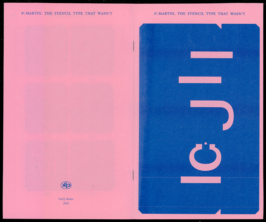
Front and back of St. Martin: The Stenciled Type That Wasn’t, folded for scanning
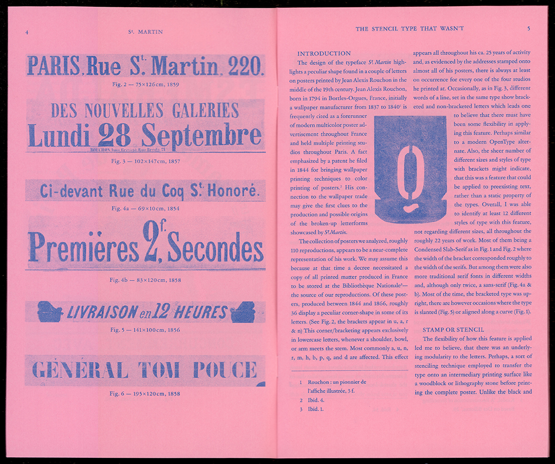
Scan of introductory text of specimen.
In the back of the specimen, I included 66 stencils cut from cardstock, which can be used to draw an 86 pt version of the typeface. The stencils were made in a way similar to those described by Kindel. By varying the horizontal offset ever so slightly, the bracketing can be reproduced.
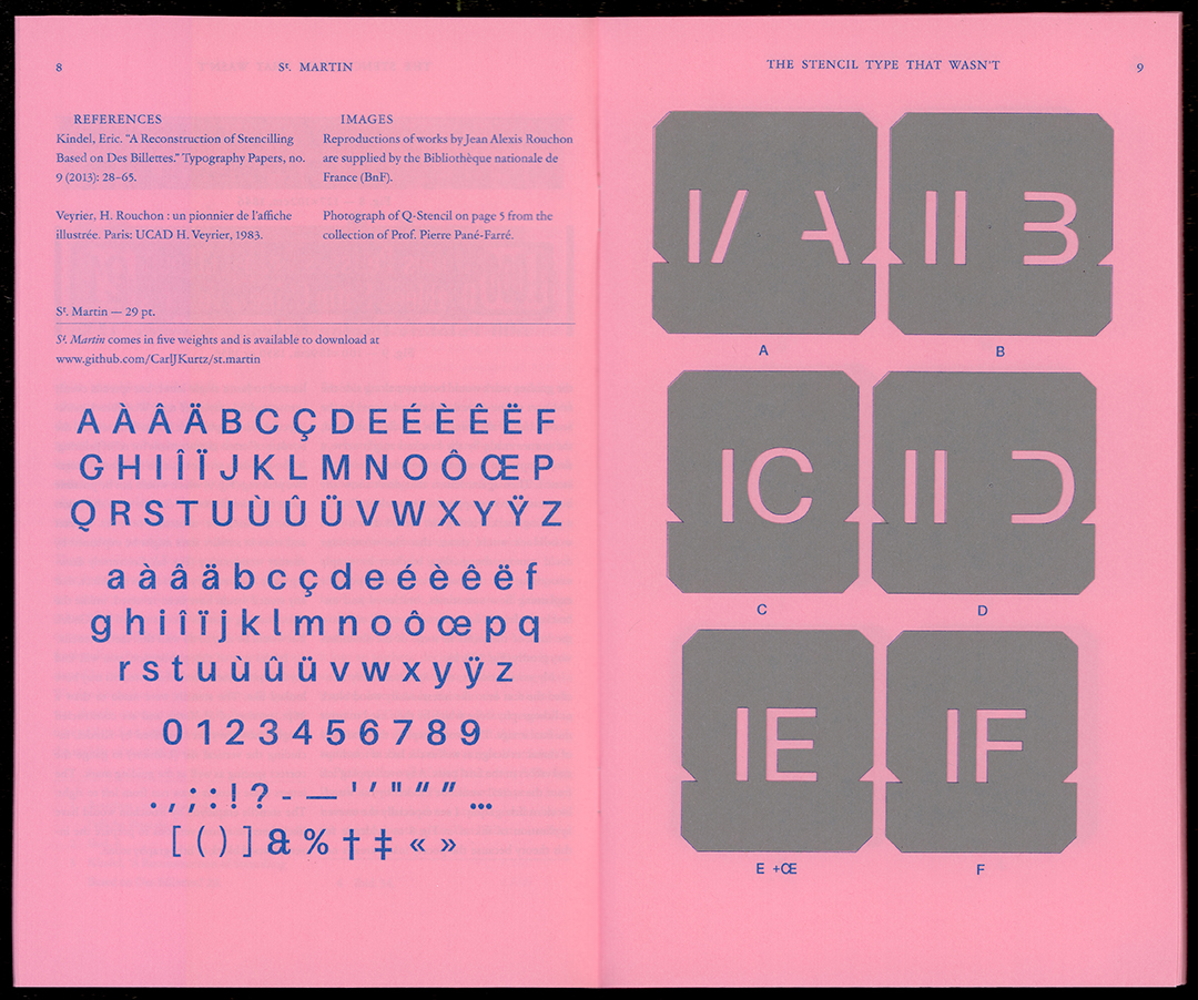
Selection of glyphs included in the typeface and example of physical stencils.
The font files for St. Martin can be downloaded for free at github.com/CarlJKurtz/st.martin
The printed specimen includes a short essay on the possible origins of the typographical artifact, as well as reproductions of the posters, a specimen of St. Martin, and outlines of the stencils. After purchasing a specimen, the 32-page magazine will be shipped to you. Please note that your version will not include the gray stencils shown in the pictures, but their printed outlines.
| St. Martin: the Stencil Type that Wasn’t | |
| Pages | 32 |
| Images | 12 |
| Stencils | Not included |
| Paper | |
| Paper | Inapa tecno Colors office paper |
| Dimensions | 170 × 280 mm closed |
| Weight | 80 g/m² |
| Printing & Binding | |
| Printer | MZ770 Risograph Printer |
| Color | Riso Blue |
| Binding | Stapled binding |
| Typefaces | |
| Body | ATF’s Garamond Text 9,5 | 15,5 pt |
| Glyphs Table | St. Martin Regular 29 | 37 pt |